One of the biggest questions that I had for Apple Watch is how they would make the device a smartwatch, and not just a notifications hub like Pebble.
Google answered this with Android Wear through deep integration with Google Now. More so than being for notifications, Android Wear is about putting the power of Google on your wrist, and in doing so, receiving context relevant information only when you need it.
The problem for Apple is that they haven't really done this with their existing devices. They have Siri, sure, but you have to know what you're looking for to use Siri, whereas Google Now will tell you what you need to know, even if you didn't know you needed to know. Apple also added "Today" view to the notification center in iOS 7, and that displayed widgets with information. The problem was they were the same all the time, not context driven.
So naturally, I was surprised when I was reading "Here's how you use the Apple Watch" today and saw this:
"...One of the biggest UI paradigms on display here is Glances. These are little widgets of information that are quite similar to the Google Now widgets found on Android Wear devices. When you swipe up from the bottom of the watch face, you can cycle through these glances — the usual suspects like calendar notifications, music controls, message notifications, and so forth. Tapping on a Glance will open the full app on Watch."
Apple, it would appear, is taking on Google Now cards on Android Wear with what they call "Glances." This is certainly intriguing, and also makes me wonder if Apple will produce more of their own widgets for iOS 8, or if we might see a full app like an Apple style Google Now in iOS 9. However, you will notice that Glances doesn't sound particularly context driven, and I can't speak on how it compares to Google Now cards until the device actually launches and I have a chance to use it.
Are you excited for Apple Watch? Do you think it needs to be more than just a personalizable notifications dumping ground that tells time? Let me know in the comments.
Tuesday, September 9, 2014
Notifications, "Today" view, Contorl Center, and Software Interface
The "today" view in iOS doesn't belong in the notifications panel. I think this is something that Android has done well. A down swipe should bring notification center, which quick launches you into apps based on new notifications. The "Today" view should be somewhere else so as to not impede on notifications, nor be impeded on.
Google Now achieves this by a swipe up from the home button (not an option on iOS) or a swipe to the right on the Google Now launcher. I don't think it's the most elegant option, but it's better than iOS's implementation.
Likewise, I don't appreciate Google's choice to include their quick settings toggles (comparable to Control Center in iOS) in the same pull down notification center. It's messy. I much prefer Apple's approach where notification are in Notification Center, and controls are in Control Center. This makes sense for the user.
I really hope that Apple will find a better place for the Today view, and sooner rather than later. I don't want to wait a year for iOS 9 to address it. And I'd love Google to move the quick toggles, but they really have nowhere else to put them, so I don't see that changing any time soon.
Monday, September 8, 2014
Motorola announcement
The new Moto X looks awesome. But I haven't heard anybody say wireless charging in the same sentence of Moto X, and that is unfortunate. There simply isn't the peripheral support for any Android device that there is for iPhone, so I am not confident that a wireless charging case will surface for the Moto X.
The Moto 360 looks awesome too. The only drawback I see is the piss-poor battery life. It's a watch, so it needs to last all day. In real life, it doesn't even last as long as the now old Moto X. My other complaint would be the thickness, I suppose, but that's not a major complaint.
I'm even more excited to see what Apple has going forward.
Monday, September 1, 2014
Console Wars
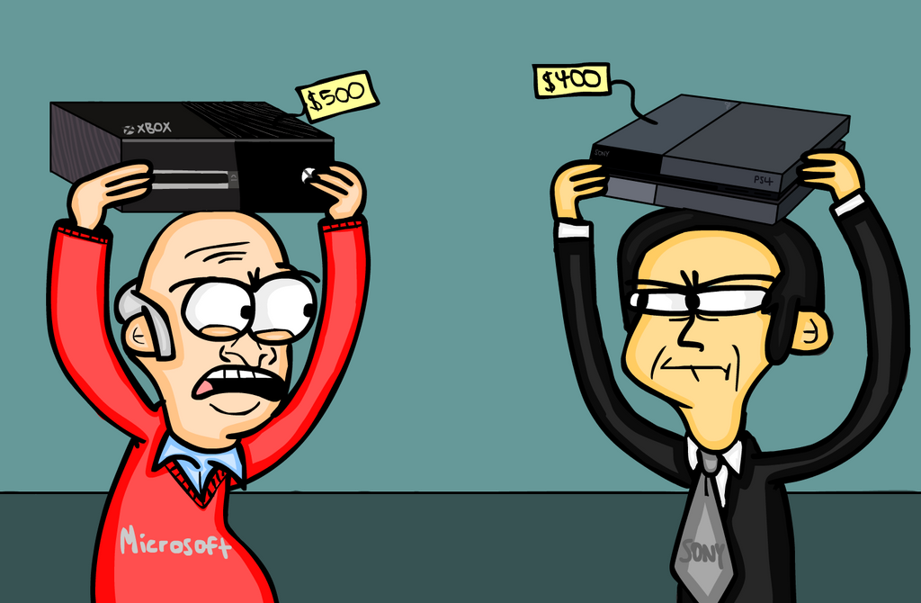
I checked out both the PS4 and the Xbox One this week, and I have to say that the result of my testing this far has been to skip this console generation.
The Xbox One undeniably is packaged better. The controller also feels generally better, especially the feel of the triggers. The use of disposable batteries is a drag, though. Also, the Xbox One itself is big and bulky, even including a separate power adaptor. Ain't nobody got time for that. The Xbox One is the far more innovative console, in my opinion (at least initially). I think Kinect, and specifically voice control, could have been a game changing (pun intended) feature. Microsoft's idea of having the Xbox One be the entertainment device was also an innovative idea, even if it doesn't fit into my ecosystem. The user interface is cluttered, and not intuitive, though, and Kinect is no longer bundled with every console, nor did it ever work that easily to begin with. Even if Halo and Titanfall are awesome, the Xbox One isn't worth the price to me.
The PS4 is packaged poorly, but beautiful itself. Bundling the power adaptor into the console was a great move. The controller feels acceptable (good, even) and I like the built in rechargeable battery. Battery life is awful, though, and I can't help but think that the light bar should have been nixed in favor of better battery life (it is dimmable in settings, though, so whatever). The triggers on the controller don't feel that great, though, especially when compared to the triggers on the Xbox One (though, in testing, I didn't hate them). I loved the 3.5mm headphone jack on the controller as much as I thought I would. Navigating audio settings wasn't the most intuitive experience, but I managed. In general, the interface wasn't perfect, but it was much more intuitive and simple than that of the Xbox One. I didn't care for the circle, x, square, triangle button naming scheme, and I never have; I like my A, B, X, Y, but that's a small gripe, and I got used to it quickly. Sony lacks the history of online gaming community that Microsoft has, and they don't have that many exclusive titles that I'm interested in yet. But it's the better gaming console.
Graphics were good on both of the consoles. Granted, I was running them both on my 720p television, so they weren't working too hard, but there's that. I did experience minor graphics hiccoughs on the PS4, but I'm pretty sure that was due to the game I was given to test: Call of Duty Ghosts (not a good game). I tested FIFA 14 on the Xbox One, since that was the game I was given, and had no graphics issues.
I also didn't experience overheating issues on either console. I wasn't terribly worried about it on the Xbox One, since the thing is huge and like 80% fans, but I thought the built in power brick and compact design of the PS4 would be a problem. After a 4 hour online gaming session, however, I didn't notice significant heat.
The thing is, playing both of these games, I never felt like I got much more out of it than I would playing the games on mobile. FIFA 14 is a mobile game. And Call of Duty Ghosts might as well have been Shadowgun: Deadzone for all I cared (generic realistic multiplayer first person shooter). The controller and the big screen are the main differentiators, and Android can use both of those easily (iOS can use controllers, but using a big screen can take some tweaking).
Regardless of all of this, I'm skipping this console generation. At least until Microsoft releases an Xbox One slim. Why you ask? Because neither console (and let's be honest, the Wii U doesn't count as a console in this generation) has everything I'm looking for. The PS4 is a better console, but the Xbox One has the better games for me. For you, things may be different. Let me know what you think in the comments.
 |
| Source: http://fc01.deviantart.net/fs70/i/2013/341/d/2/ console_wars_cartoon_by_buddycomics-d6x0wmk.png |
The PS4 is packaged poorly, but beautiful itself. Bundling the power adaptor into the console was a great move. The controller feels acceptable (good, even) and I like the built in rechargeable battery. Battery life is awful, though, and I can't help but think that the light bar should have been nixed in favor of better battery life (it is dimmable in settings, though, so whatever). The triggers on the controller don't feel that great, though, especially when compared to the triggers on the Xbox One (though, in testing, I didn't hate them). I loved the 3.5mm headphone jack on the controller as much as I thought I would. Navigating audio settings wasn't the most intuitive experience, but I managed. In general, the interface wasn't perfect, but it was much more intuitive and simple than that of the Xbox One. I didn't care for the circle, x, square, triangle button naming scheme, and I never have; I like my A, B, X, Y, but that's a small gripe, and I got used to it quickly. Sony lacks the history of online gaming community that Microsoft has, and they don't have that many exclusive titles that I'm interested in yet. But it's the better gaming console.
Graphics were good on both of the consoles. Granted, I was running them both on my 720p television, so they weren't working too hard, but there's that. I did experience minor graphics hiccoughs on the PS4, but I'm pretty sure that was due to the game I was given to test: Call of Duty Ghosts (not a good game). I tested FIFA 14 on the Xbox One, since that was the game I was given, and had no graphics issues.
I also didn't experience overheating issues on either console. I wasn't terribly worried about it on the Xbox One, since the thing is huge and like 80% fans, but I thought the built in power brick and compact design of the PS4 would be a problem. After a 4 hour online gaming session, however, I didn't notice significant heat.
The thing is, playing both of these games, I never felt like I got much more out of it than I would playing the games on mobile. FIFA 14 is a mobile game. And Call of Duty Ghosts might as well have been Shadowgun: Deadzone for all I cared (generic realistic multiplayer first person shooter). The controller and the big screen are the main differentiators, and Android can use both of those easily (iOS can use controllers, but using a big screen can take some tweaking).
Regardless of all of this, I'm skipping this console generation. At least until Microsoft releases an Xbox One slim. Why you ask? Because neither console (and let's be honest, the Wii U doesn't count as a console in this generation) has everything I'm looking for. The PS4 is a better console, but the Xbox One has the better games for me. For you, things may be different. Let me know what you think in the comments.
Monday, August 11, 2014
Beats Studio Heaphones: Not for Studios, but Still Good
Audio snobbery aside, the equalizer on the Spotify app shows exactly why the new Beats Studio headphones are so popular, and actually not half bad.
To the right is an image that attempts to show the sound profile of these headphones. Understand that this is playing an actual song, so the sound signature isn't exactly like this, but it gives a pretty good idea. Note that this test is performed with the headphones on a microphone, so take that for what it's worth.
As you can see, the latest Studio's bump the bass, and raise the highs, leaving the mids to look a bit saggy. Audiophiles generally hate this kind of non-flat, studio, pure sound.
Let's take a quick look at the Spotify equalizer on the left, though. On the rock setting, we see this same type of sound altering, with an increase in bass and treble causing a "scooping" in the mids. Obviously, in the EQ settings, the curve is much more fluid, but it is still extremely similar to the curve we see in the headphone test. This "scooped" curve is also similar to what we see in other EQ settings like R&B, Hip-Hop, Electronic, and even Jazz and Classical to an extent.
Yes, you wouldn't want to use these to record and mix the music in a studio because they have nowhere close to flat sound, but that's not what consumer audio should do. Leonard from Kosmic Sound explains this point in the video below describing studio monitors. Watch from 0:50 to 0:58.
To sum up his point, consumer audio is about taking recorded tracks and making them sound better.
That's what Beats does with their new studios. And they also do it in style and comfort. Are they for everyone and every purpose? No. Are they expensive? Yes. But they are really good for most people and most uses.
 |
| Source: https://www.youtube.com/watch?v=GphNpU1V-zU#t=223 |
To the right is an image that attempts to show the sound profile of these headphones. Understand that this is playing an actual song, so the sound signature isn't exactly like this, but it gives a pretty good idea. Note that this test is performed with the headphones on a microphone, so take that for what it's worth.
As you can see, the latest Studio's bump the bass, and raise the highs, leaving the mids to look a bit saggy. Audiophiles generally hate this kind of non-flat, studio, pure sound.
 |
| Source: http://cdn.array.se/ files/2014/07/spotify_eq_ios_dump.jpg |
Let's take a quick look at the Spotify equalizer on the left, though. On the rock setting, we see this same type of sound altering, with an increase in bass and treble causing a "scooping" in the mids. Obviously, in the EQ settings, the curve is much more fluid, but it is still extremely similar to the curve we see in the headphone test. This "scooped" curve is also similar to what we see in other EQ settings like R&B, Hip-Hop, Electronic, and even Jazz and Classical to an extent.
Yes, you wouldn't want to use these to record and mix the music in a studio because they have nowhere close to flat sound, but that's not what consumer audio should do. Leonard from Kosmic Sound explains this point in the video below describing studio monitors. Watch from 0:50 to 0:58.
To sum up his point, consumer audio is about taking recorded tracks and making them sound better.
That's what Beats does with their new studios. And they also do it in style and comfort. Are they for everyone and every purpose? No. Are they expensive? Yes. But they are really good for most people and most uses.
Saturday, August 2, 2014
Is the Google Now Launcher Actually Android Silver in Disguise?
In case you hadn't already heard, the Google Now Launcher is now available to all Android devices running 4.1 and newer. Details are included in Google's official video below.
My question is: could this be the Android Silver program that everyone was talking about?
For those of you that don't know, for a couple of months before Google I/O, there were lots of rumors surfacing about the end of the Nexus program, and the start of launching flagship devices from OEM's with stock Android.
I haven't been putting much stock in the rumors, because I don't feel that's an approach that Google would take. The Nexus program has been growing and shows strong sense of life, and I think it would be stupid for Google to kill that. Likewise, OEM's would not be happy with Google, I would think, releasing Google versions of their devices sold mainstream, not just through Google Play. Android skins are how OEM's feel like they differentiate themselves from the competition. Not to mention the fact that they would sell a lot fewer devices that weren't running stock software.
My thought is, though, that the release of this launcher to the Play Store is actually what Google was doing, and that this is the rumored "Android Silver." It fits with Google's assertion that they aren't killing the Nexus program any time soon. It also gives non-stock devices a more Googley feel.
I think this is one of the best things to happen to Android since project butter, by the way. But I'm interested to know what you think. Do you think this is "Android Silver?" Do you believe the Nexus line is dying? Let me know in the comments.
Subscribe to:
Posts (Atom)